
A total transformation


This was another job where I was brought on board to work on the layout design then stayed with my lovely clients to help them with some of the design decisions. Working in a space like this where you’re dealing with roof angles and funny nooks can be a real challenge which is why they reached out in the first place.
Rotating the vanity and having it fit the full space under the window was cruital in maximizing the space and storage. It felt like this gap was made for it and removed the galley feeling of having the bath and vanity opposite each other. This large yet awkward room felt too big to have a single basin and they had bottles everywhere, now they’re tucked away and the room feels much more balanced.


Another key decision was removing this small nib wall and swapping the door around so that it opened to the right. Previously this space had felt tight and closed off. By then placing the toilet on the back wall, you still have privacy but the room feels so much more open and flows better.

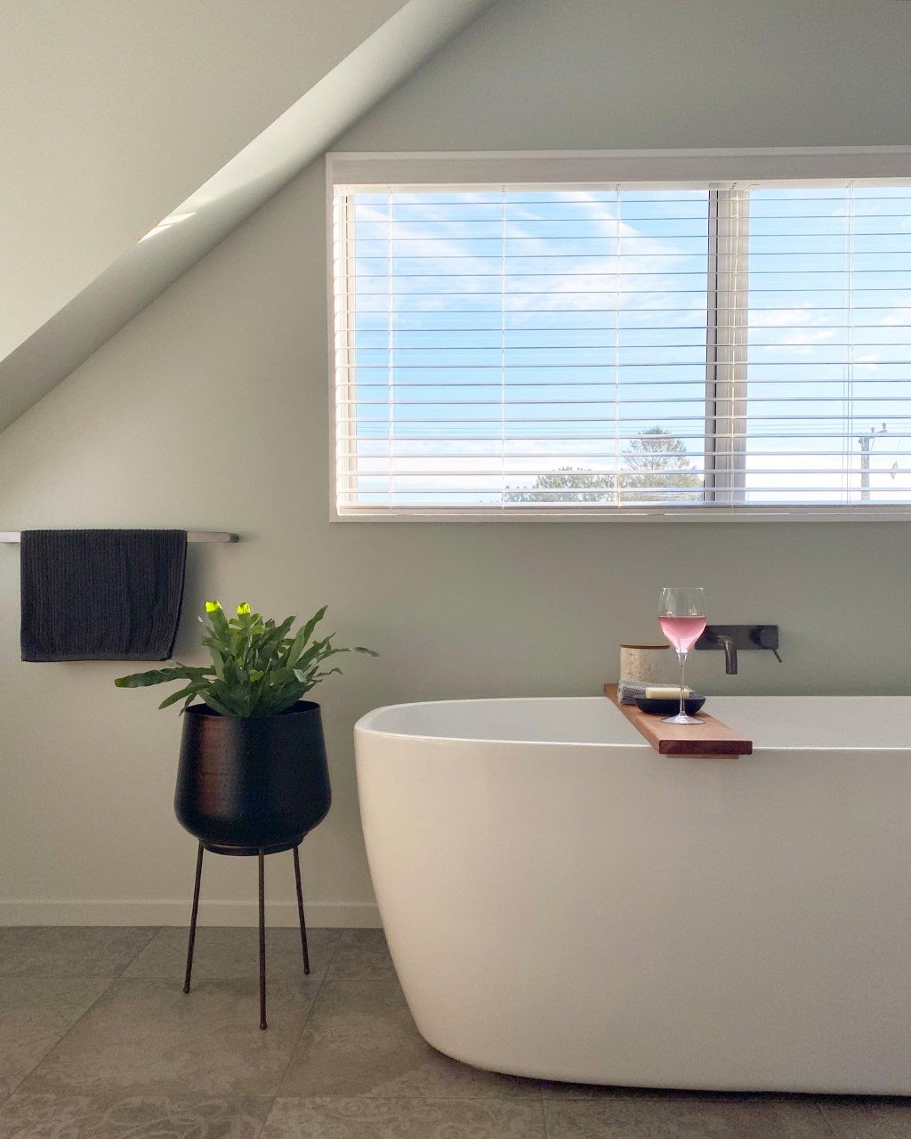
I wanted the first thing you see from the hallway when the door is open in the bath central to the large window. Previously it had been shoved to the left and tucked under the angle of the ceiling pitch. This made the space feel tight and cramped, now with a large freestanding bath it feels open and spacious. Allowing the quirks of the ceiling to shine and not feel like they’re impeding on the space.


Lets talk tiles! The floor tile we chose is a lovely light-mid grey but we chose something with this beautiful subtle pattern in it which has a very vintage feel. This leaned into the older roots of the home but with a modern take. It’s something that you don’t notice instantly on walking into the space but draws your eye subtly when you’ve been in there.
The green brings warmth and contrast with the walnut timber of the vanity. It brings some of their surrounding green in to the bathroom and also draws your eye down to this end where the vanity it. It’s bold and brings a real pop of colour to the room.

