Bathroom with a view!
This bathroom is actually the first thing you see when you walk up the stairs so I wanted the view from the doorway to have immediate impact upon arriving upstairs. Having the first thing you see be the bath central to the door and with the feature pendant above did just this. I love this pendant for the softness and movement it brings. It also ties in beautifully with black metal elements they have in the living and dining rooms linking the upstairs with down.
The view from this bathroom is simply breathtaking. You can see the port of New Plymouth and watch the ships come and go with all of that beautiful green below you. We centred the bath not just to the entrance doors but to the large sliding door outside in order to balance the space. This space is lovely and private so we ditched the old curtain and left the doors wide open to let the outside in.
Can you imagine a bath with this view and not being a bath person?!
I was actually originally brough in to help with the layout planning of this large space. And while we played around with alternate layouts in the end keeping the main fixtures close to where they were originally been placed worked best for the room. Which was a bonus in saving on relocating plumbing which can really skyrocket a reno.
This bathroom really had a lot going on visually, rendered concrete walls, curves and contrasting sharp lines. It was a bit of a visual nightmare, not to mention the hassle to clean that shower that was essentially like a driveway! It was a full gut job, which my clients demo’d themselves with a little help from friends and family - she was no small feat!
Tile choices:
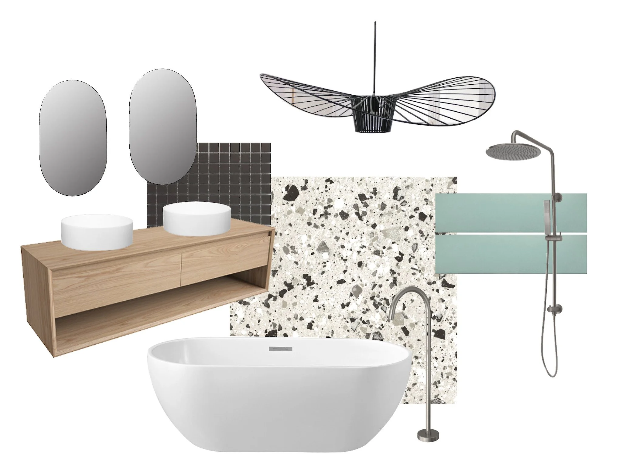
Flooring: the light grey terrazzo was one of the first decisions we made. The fleck ties in with existing stone chip concrete elements in the home, but in a modern yet timeless way. The beauty of terrazzo it it’s not it’s first time in the design spotlight and due to its Italian roots is simply ageless. You can find this tile here.
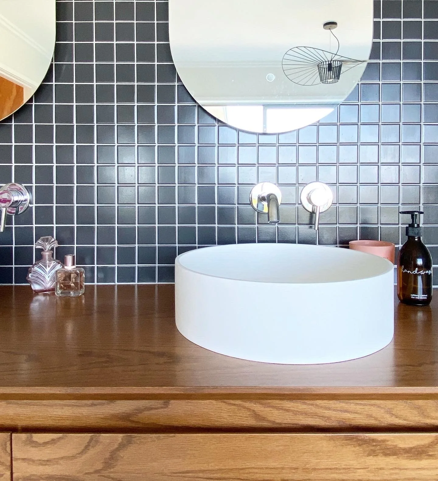
The small charcoal mosaic tile on the back wall was chosen for numerous reasons. The aim was for this large wall to fade into the background and allow the shutters and vanity to shine. A large tile actually would have had the opposite effect, choosing sometime small allows the other design features to shine and doesn’t compete with the rectangles of the louvers. By using a light grey grout (same as the floor) the square pop so the whole wall doesn’t feel like a dark mass. This room lets in incredible amounts of light due to the large doors, a light tile would have reflected this light back so I chose a dark tile which would have the opposite effect and absorb it. The slate grey also ties in seamlessly with the fleck in the floor. You can find these here.
I wanted to draw some attention to the shower area so chose a third tile to bring in some colour and softness. The blue is a beautiful match for the colour in the adjoining master bedroom and has a coastal vibe which suits this homes location to a t. The rectangle shape was specifically chosen to tie in with the shutters, and square stacked to mimic their shape. Repetition is key for cohesive design even if your brain doesn’t register it your eye will and ensure the space just feels right even if you can’t pin point the nuances. Click here to shop this tile.
I love how the recess vanishes in the small squares.
The beautiful blue draws your eye down to this corner and softens the space.
I love looking back at moodboards I’ve put together for a space and seeing how the vision came to life!


