Restoration & Rejuvenation
Sometimes it’s hard the see the potential of your tired old home. We so easily get used to living with what we have, it can be hard to envision how a new layout would make it more functional or how a different colour on the walls would completely change the vibe. If you’re struggling to visualize your space, or even where to start when it comes to tackling a renovation, get it touch and I’ll help you transform your home into a place you want to spend time in and enjoy.
Check out some of the projects below for inspo and to see how with a little Home Candy magic your place too can be rejuvenated and refreshed.
good bones - much needed makeover
This beautiful old home built in the early 1960’s was completely untouched prior to my clients taking on this mammoth renovation project. With solid bones it just needed a few tweaks to the layout (and a complete interior overhaul) to be brought into this century. It was a delight to work on this project, right from the initial layout design right through to the finishing touches, becoming a warm comfortable family home for my lovely clients and their growing family.
Check out the before, after and even some in between shots here.
timeless traditions on the farm
These lovely clients were crammed into a wee farmhouse and desperate for some extra space, and room to breathe for their growing family. The resulting addition gave them much needed square footage so they can thrive for years to come on the family farm. Working to their traditional style to create a modern yet timeless home for them was such a joy.
To see how this space has been given a modern makeover that will stand the test of time click through.
80’s brick given a new lease on life
This project was so much fun! I absolutely love a retro moment and these clients were brave and bold embracing my design ideas which resulted in a renovation that reflects their personality and style as well as staying true to the bones of the home.
The before and after snaps on this gal are worth the click through!
kitchen goals
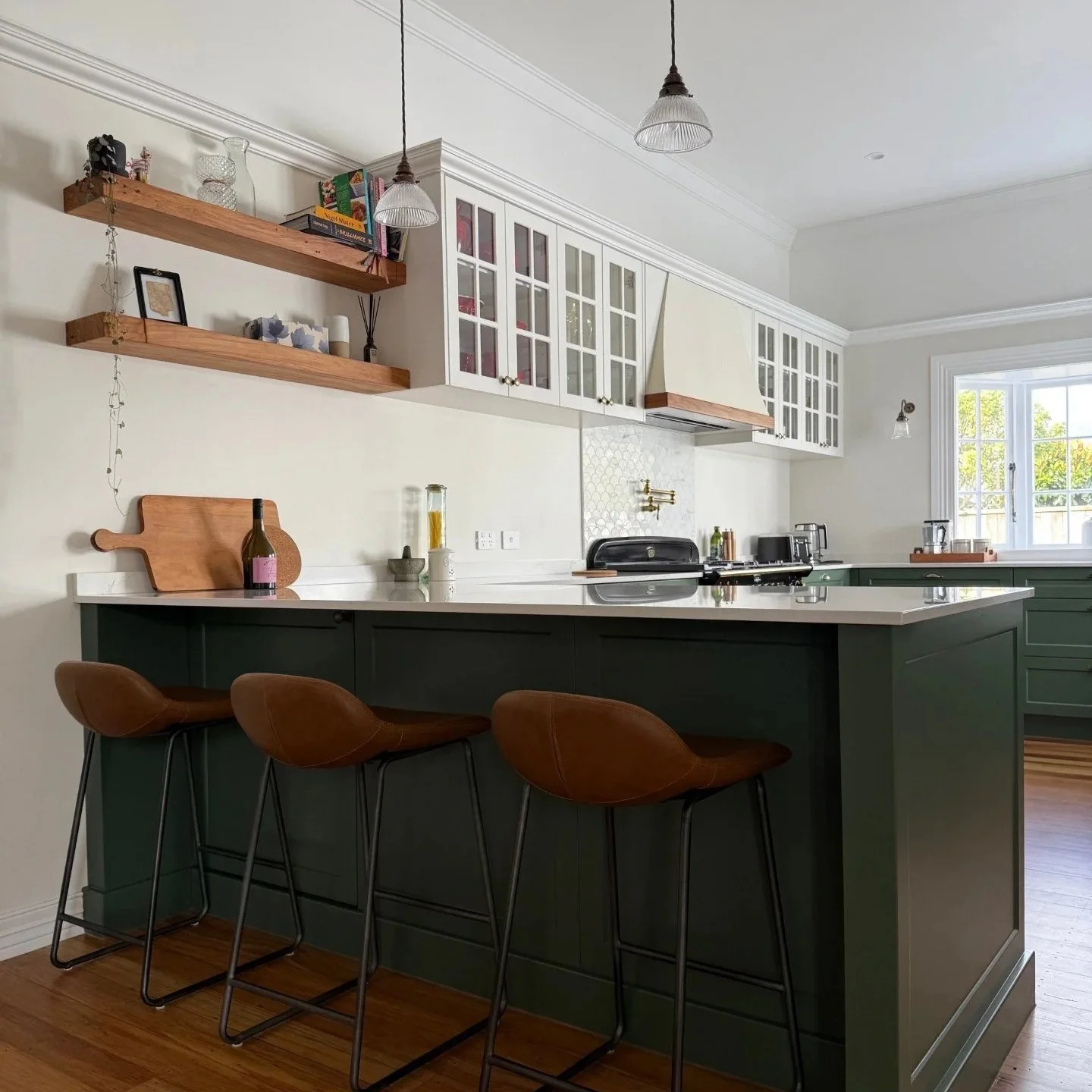
These lovely clients had been living in this house for several years and putting up with a poorly design 80s renovation. The kitchen was cramped and didn’t function well for daily family life, let alone entertaining which they love to do. Working on this home from start to finish, from layout design through to the finishing touches was such a joy.
To see how far this space has come, including a few during shots and the layout planning click through.
You can also see a reel of the finished reno on my Insta !
modern makeover
This early 200'0’s build was full of fun angles to work with, but the main challenge was letting all of the beautiful sunshine trapped in the second lounge out into the main living space. It’s another renovation I was fortunate enough to be involved in right from the layout planning through to the end result.
Renovations can be incredibly stressful, especially when you’re in the thick of it. At one point I’m sure these clients were wondering what they were doing ripping their perfectly ‘fine’ house apart, but it was all worth it in the end. Learn more about this renovation, see before during and after pics, here.
villa glow up
Working on older homes is a real passion, and this villa restoration was a pleasure and a privilege to work on. Restoring character while bringing this old girl into the modern world is always a balancing act when it comes to restoring a home of this age. But working with clients who understood the charm of a villa, and who love colour made this project so much fun.
large space calls for bold design
Small spaces are often thought of being the most challenging when it comes to interior design, especially layout planning. And it’s true they certainly have their difficulties, but just as, if not more challenging are overly large spaces, like this bathroom. It in fact used to be a bedroom and was turned into a bathroom by previous owners to my clients. And while they put up with the very quirky space (seriously I’ve never seen a bathroom like it, before or since!) once it started to leak to their downstairs it had to go…
I know I say this every time, but the before snaps of this are really something to behold. Make sure you click through to see what decisions we made and why for this beast of a reno.


